There are a lot of posts & articles about managing icons in Sketch. But none of them seems complete & they are scattered. It was tough for me to get the whole picture of this icon mystery. However, in this article, I will try my best to explain the whole icon workflow I use in my projects (from creation to developer-handoff)
Prerequisites
- You need to have Sketch App (Latest Version preferred, Must be version 49 or newer)
- Have some basic concept about how Symbols & Libraries on Sketch work. (TIP: You can check Sketch Together’s (AKA Pablo Stanley) video on Symbols from here & video on Libraries from here)
- The basic idea on sketch shapes, shape
unifying & Bezier curve tool. (TIP: Amazing author Peter Nowell wrote articles on Mastering the Bézier Curve in Sketch & What’s Up With Sketch’s Scissors Tool? is worth the read if you want to design custom icons.)
Careful about timing!. This article might take more time than you expected.
Getting in the subsystem
If you have previous experience about creating a library and symbol this will be a fairly easy process for you. You can get the icons in your design file instead of a totally different library, but here are some of the reasons why you shouldn’t
- You are designing different products with the same icon sets – I work for a company named Dingi Technologies Ltd which have a multitude of location service products but all of them have a consistent design system. So all of the icons are from the same library. Also, I tend to keep web & mobile version in different sketch files and use the same library.
- You can Add/Remove/Update icons once and see the changes everywhere – When you update icons/things on the library the files which used the library will see a notification to update the library and reflect the changes. Adding icons is also a breeze in libraries.
- Export & Developer handoff – If you keep your icon in the same file, exporting them might be a tough task for you. There are a lot of other files which might hamper the workflow when exporting.
- To keep your design system clean – I guess this one doesn’t need any explanation. Also if you have “Clean System OCD” Like me keeping the file in a different library is a must.
Let’s begin creating
One popular theory about creating the design is creating & trying out the things first and when you think there is a flow/vibe going on then organizing the system before it gets too messy. I usually try out one screen first & when I see the vibe, I separate out the icons first.
As you know Libraries are basically simple sketch files, Let’s say after some trial and error I got four icons & two colors for them. So for creating the subsystem, we will be needing a sketch file. Lets call it test_icon_subsystem.sketch
Create a square artboard at your desired grid size. I mostly use 24*24px.
Grid size will depend on your usage, even though they are vector you should try to keep the most commonly used size in your design.
You can create custom artboard presets on your desired sizes. By pressing insert> artboard or A > select custom from the right top of the inspector> Create custom size from the bottom the inspector. Fill up the name & size field, then press save.

Now you can place the first icon in your empty art-board. Remember to keep a padding surrounding the icon (2px-3px) as shown in the image below) this helps to create consistent & optically balanced icons.

- More on optical balancing – You will see some icons have more width but less height sometimes, sometimes you’ll have to use more height less width, or sometimes square. So, to make them appear consistent you need to use optical balancing. To learn more about optical balancing check This Article
- Icon naming convention – You’ll be needing to name the artboards systematically to use them in an organized way. I use categorized naming conventions with some
bem mix. i.e – icon/action/home, icon/social/facebook. This helps me finding & inserting the icon by category whenever needed. However, you can use any kind of naming convention you want. Don’t worry about it too much though, as you can always change it.
Shapes
You’ll be needing to outline all the strokes and make a combined shape(There should be one shape per icon as shown below). You don’t need to worry about color, for now, use any fill color. And make the shape a mask. (Right click on the shape layer > Make mask)
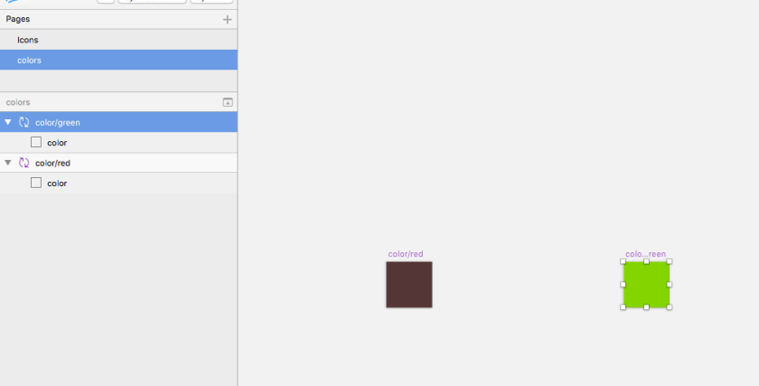
Color
We will have a square named color & make it the color we want. Choose your desired fill color & keep it above the icon shape. As the shape is masked the color will be filled in the shape. This layer will help to change & overriding colors. Don’t forget to remove the color from shapes fill. As a result, you’ll get something like the image as shown below.

If you use fill on shapes, you’ll be limited to that color only. Using a colored rectangle symbol as a mask allows us to override the colors whenever you want. Also, the scaling becomes much easier.

Making Symbols
Now its time to make them reusable. Make a symbol from the color layer. This will send it in the symbols page. Now make the artboard a layer and it will not send it in the symbols page. Now you got two pages. One is an icon & another one is color. Like the image below. You can name them if you want.

Protip – when you don’t want your layer to go to symbol page but want a symbol out of them Create an artboard, put the layer in it and make it a symbol.
Extending
When you want your other colors to the icons. Duplicate the color symbol & change the color. Also, name the color symbols like color/blue or color/primary or whatever you want so that you can access them later. Also, you can create new icons by duplicating the existing icon and replacing the shape with no fill and then make the new shape a mask.
[If you still don’t understand how it works, please carefully watch the video posted below]
Plugins for making things easier
Sketch-Icons – Now that you’ve got an understanding of how this type of icon system works, You can make use of Sketch-Icons plugin to make things faster. However, I still like to do it manually. It gives me better control over things.
Symbol Organizer – Also when you’ve created many icons, organizing them needs the Symbol Organizer Plugin. This will help you see them and find them easily
More.. ..
That’s it for
Update
- Link to Part 2
- Link to Part 3
- The .sketch file I created
2 thoughts on “How I Manage My Icons In Sketch. – Part 1.8 min read”